Schlagwort: Wetterextreme
-

Klima + Soziales = KlimaSocial
Liebe Webseite, es tut mir leid, aber ich habe ’ne Neue. Ich werde nun mehr Zeit mit meinem Angebot bei riffreporter.de/klimasocial verbringen. Dort schreiben einige Kollegen und ich darüber, wie wichtig die sozialen Prozesse sind, um den Klimawandel zu bewältigen. Nach dem Motto: Klima + Soziales = KlimaSocial. Der erste exklusive Artikel dort beschreibt die…
-
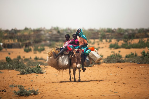
Der Klimawandel ist da, da und da
Bis vor kurzem haben Klimaforscher diese Frage gehasst: „Ist das schon der Klimawandel?“ Wenn Wälder brannten, Städte glühten, Felder vertrockneten oder anschwellende Flüsse Dörfer versenkten, dann rief bestimmt jemand an und wollte das wissen. Und meist war dann die Antwort: Es ist unmöglich, für ein einzelnes Extremereignis genau anzugeben, was es ausgelöst hat – oder…